Flagship Application for a Flagship Retailer
Jarir Bookstore is Saudi Arabia’s largest retailer of books and consumer electronics, with over 37 branches across the Kingdom. Jarir hired us to design their new mobile application and deliver a mobile e-commerce experience that is visually appealing and simple to use.
Project Challenges
E-commerce in Saudi Arabia
While an established and trusted brand, Jarir faced the same challenges as most retailers in Saudi looking to enter the digital commerce market.
A young e-commerce market where customers have trust issues about the security of online payment and a lack of faith in unreliable delivery services, mean that any e-commerce retailer in the country starts on the back foot.
Specific to Jarir, with their abundance of branches, many customers we spoke to felt it was easier to simply head into a nearby store to buy a product rather than rely on making the purchase online. With convenience being one of the most commonly cited reasons for online purchases, this view of offline shopping at the physical retail location being the easier option would be an additional barrier to overcome.
The challenge became to not only create designs that were visually appealing, they also had to deliver an experience that increased trust and made the process of finding and purchasing a product so simple that it would be preferable to making the purchase offline.
Third-Party Development Team
Development of the application was the responsibility of a third-party team. Miscommunication between design and development teams is always a potential source of risk to any project. When designing a complex e-commerce app requiring detailed interaction and visual design guidelines, that risk is magnified.
We knew that our transition design documents and interaction maps needed to be comprehensive while also being extremely usable and simple to understand. This is time-consuming work and would add more strain to what was already tight project schedule but was necessary in order to ensure that development work would start on time.
Primary Objectives
- Improve user journeys through the app in order to offer an amazing experience
- Increase conversions and reduce cart abandonment by designing a streamlined and usable checkout process
- Facilitate increased revenue by intelligently incorporating cross-selling into the app’s design
- Develop an intuitive information architecture that makes it easy for both first time and experienced users to find the products they’re looking for
- Inspire and delight users with a polished visual interface that increases brand loyalty and satisfaction leading to increased trust
What We Did
- Stakeholder Interviews
- Competitor Analysis
- Expert Usability Evaluation
- Wireframing & Prototyping
- Information Architecture
- Interaction Design
- UI & Visual Design
- Iterative Usability Testing
Our Approach
At UXBERT, we implement a user-centred design (UCD) process to all our projects, ensuring that the business goals and user needs are at the core of our work.

The key feature of the process is that it involves users throughout design and development. Thinking about design in this way helps us to ensure that every design decision we make is based upon an explicit understanding of the user’s tasks and environment, addressing the whole user experience.
Research & Information Architecture
If the purpose of user-centred design is to ensure we design for the end user, it’s research that tells us who that person is and what they need and expect from the product. User research ensures that we design for the user and not for ourselves and that design decisions are made on the basis of data rather than opinion.
Competitor Analysis
By analysing mobile applications already in the market we were able to collect insights into the experiences that Jarir’s competitors were already providing to customers. This helped us to set initial benchmarks to compare the existing Jarir app to as well as guiding our subsequent research approach.
Analysis was done by conducting expert usability evaluations of both national and international (Souq, Amazon) competitors whose mobile applications this project would be competing with both directly and indirectly.
An expert usability evaluation involves having a certified usability professional examine the mobile interface and it’s various dialogue and judging its compliance against a recognized set of usability guidelines. Usability is a quality attribute that measures how easy an interface is to use. The guidelines used for an expert review are established on the basis of scientific research into user behavior and human-computer interaction.
Usability Testing the Existing and Competitor Apps
Usability tests are one-to-one research sessions with actual customers. The test consists of the user performing a series of representative tasks (finding a product, comparing different products, making a purchase) while being observed by an experienced moderator.
We conducted tests on both the existing Jarir mobile app as well on the competitor apps that were reviewed by the usability evaluator. Users were recruited for testing based on fitting into target customer profiles provided by Jarir.

One of our moderators reviewing video recordings of a usability test session.
These tests identified flaws in the existing designs. We uncovered insights into how users actually behave and the frustrations they encounter when using the app. We also see where and why they fail to achieve their goals (and hence why the business loses a sale).
The gold standard of usability evaluation, usability testing ensures that we can observe what users actually do, and not just what they say they do, which is often not the same thing.
User Interviews & Persona Development
In conjunction with carrying out usability testing, we also interviewed the users we tested.
These interviews helped our researchers to build empathy with users while simultaneously uncovering pain points they face that wouldn’t be uncovered from testing alone. This approach helps us to reframe our own perspective of the problem to point the way to unrealized possibilities for design and innovation.
The feedback from these interviews were collated and used to create a series of User Personas to be used as a tool to connect the different stakeholders to the actual users.
Based on research about behaviour and user goals rather than simply demographic data, personas are a fictitious identity that reflect a target user group. While depicted as a specific person, they are in fact synthesised from observations of many people.
We use personas because the average user doesn’t exist. Personas aid designers to create different designs for different kinds of people and to design for a specific somebody, rather than a generic everybody.

One of the personas developed for the project.
User Journey Map
As with any multi-product retail e-commerce app, Jarir’s mobile application would need to cater to multiple user goals and therefore journeys.
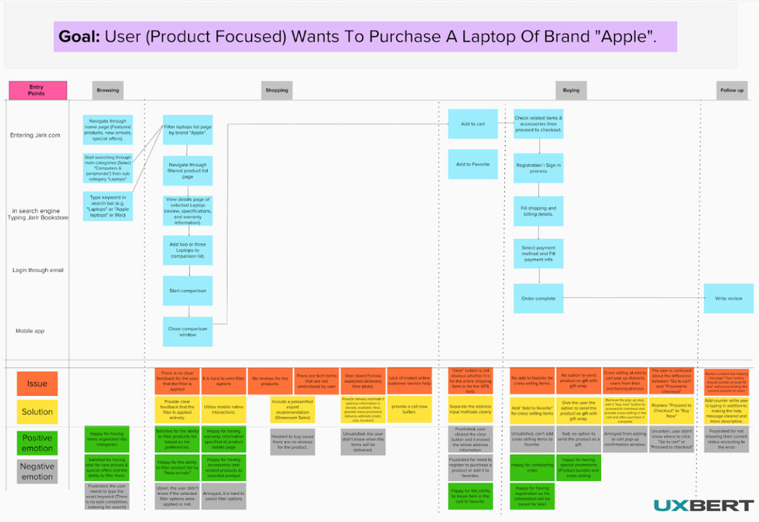
From our initial research we collected a range of data for each of the steps through the different journeys a user would take using the app. The most effective way to communicate these insights to the different stakeholders of the project was through the use of user journey maps.
User journey maps are a visual interpretation of the overall relationship with a business from the user’s perspective over a period of time and across different channels.
By identifying the steps a user takes when interacting with a product, they help us understand user behavior while emphasizing the important intersections between user expectations and business requirements.

Mapping begins with pen and post it notes allowing for it to be a collaborative process.
Once the user journeys have been mapped out, they’re digitized to allow for easy sharing and access.
Through this high level approach, we’re able to understand the key tasks users want to do, the context of those tasks and what sort of functional requirements will help enable those tasks.
The maps we created illustrate the context of each step, progression between different steps, devices they’re using, functionality they’re expecting at each step as well as their emotional state at each step as well as any pain points they encounter.

Once the user journeys have been mapped out, they’re digitized to allow for easy sharing and access.
From our understanding of these pain points, we’re able to feed the info into the our design decisions to develop solutions to the pain points.
Approaching the user journey from this perspective helps us to consider the entire experience as a whole, which in turn delivers designs that focus on long term relationships with customers built on consistency and trust.

UXBERT’s polished client deliverable version of a journey map.
Information Architecture (IA)
On a mobile ecommerce platform such as the one we were designing for Jarir, how easily users are able to find the information they’re looking for (items, product descriptions, delivery information, etc.) would be key to the success of the app.
Just as important, in order to meet business requirements, the IA would also need to facilitate exploration within the app. Users should be able to browse and discover related products simply while at all times knowing where they are within the app.
Deficiencies in the information architecture would cost Jarir money. Both in terms of lost customers because they couldn’t find the product that they were looking for, as well as missed opportunities to cross-sell relevant products to interested customers.
We started by created a sitemap identifying all pages of the existing app and their connectivity to help visualise hierarchy and structure of the app. Upon identifying navigational and structural issues using data collected from research, we created an updated version of the sitemap. This was the first step of laying out the IA of the new mobile app, setting out the framework upon which we would continue to build the site navigation.

Finalized sitemap
UI, Interaction & Visual Design
With the research behind us and a new site map developed, we moved towards the design phase of the project. It’s at this phase that we start to shift our focus away from abstract issues of strategy and scope towards those that determine what the users eventually experience.
As with the entire process, the user continues to remain at the centre, through iterative prototyping and testing.
Sketching & Wireframing
Design begins with pen and paper. Sketches are used to rapidly put variations of different ideas on paper. Next up we hold a ‘ideation’ session with experts from different specialities (project managers, researchers, usability experts, UX designers and visual designers). Each team member brings their own point of view to the session after which a much clearer picture begins to emerge of will be the first iteration of the app’s design.

Sketching the first iterations of designs.
Next up the sketches are developed into digital low-fidelity wireframes. Wireframes act as the blueprint of the design, allowing us to develop a visual representation of the interface which can be used to communicate structure and information hierarchy. After reviewing wireframes with the client team and making any resultant changes, the wireframes are used to develop the digital prototype to be used for testing.

Example wireframes

Wireframing also involves creating multiple variations of even the simplest details and features to be tested by potential users before we decide on one solution. Here we see multiple versions of the app header.
Prototyping
While wireframes have a value as a tool on their own, in this process we were mainly concerned with using them to build our initial prototype.
Prototypes are a concrete representation of a design idea that serves the purpose of asking and answering design questions. They allow us to test the usability of designs directly with users before a single line of code is written.
Through the use of prototypes, we were able to quickly test and refine the app design’s navigation, content, page layout and functionality.
The key to testing with prototypes is that we were able to collect usability data by testing with users early, which is what leads to the biggest improvements in UX and saves time, effort and ultimately money by reducing the need for changes later down the line after development has begun.
Usability Testing Prototypes and Iterative Design
As mentioned above, the aim of developing prototypes is to validate and collect feedback on user journeys through the new design.
A key feature of the UCD process, iterative design seeks to embed design and evaluation steps into the process from the first stages all the way through to implementation.
We tested multiple versions of the prototype. With each iteration, tests were run with a series of representative users, usability data collected and then fed back into the design process, resulting in an updated version of the prototype. The key was to establish a tight feedback loop that continuously improved the designs until a final version with the best possible user experience has been reached.

Variations of the product details page as we go through different iterations of testing. Only once the final design has been signed off are visuals applied.
For this project, we ran three cycles of testing, testing with 5 different users in each cycle. Research shows that testing with just 5 users will uncover 80% of usability problems in your design. The first two cycles of testing were conducted in our purpose built state-of-the-art usability testing lab with users recruited through our dedicated database based on target customer profiles.
For the final cycle of testing, we set up a mobile testing unit on the showroom floor of a Jarir branch and invited customers who were shopping to take part in the session.

Mobile usability test setup in Jarir showroom
Visual Design
With the skeletal structure of the application now in place, our efforts turned towards the visual design of the UI.
Visual design plays an essential role in establishing relationships between content and guiding users through actions. For Jarir’s mobile app, it was important that we considered how to strategically implement images, colours, fonts and other elements in a way that would both enhance the design and engage users.
Mobile experiences require particular attention be paid to how the design draws attention to the most important pieces of information while aiding scanning and readability. Limited screen size and a tendency for users to be easily distracted while using mobile means careful consideration needs to be made about what the user actually needs and what the business wants the user to do.
One of the things we need to take into consideration to achieve this is the removal of visual noise. We did an analysis of visual noise on the page to progressively remove all elements that distracted from the main purpose of the page.
![]()
Visual noise analysis using the eye tracking device in UXBERT Usability Lab
Equally as important as the practical implications of visual design, there’s an aesthetic-usability effect that comes into consideration. Research shows that users perceive designs that look easy to be easier than those designs that don’t, even where there is no measurable difference. As such, visual design has as much of an effect on the overall experience as actual usability.
Aesthetic considerations needed to take into account Jarir’s own brand values and unique personality.
Interaction Design
Side by side with the visual design, we develop the interaction design of the app.
The key to designing usable interactions is to have an understanding of how users anticipate and behave with technology. Through insights into behaviour collected through testing of prototypes and using established interaction design principles (based on cognitive psychology and HCI guidelines) we were able to design interactions that made it as simple as possible for users to perform their tasks on the app in order to meet their goals.
An example of interaction we designed based on insights from testing was the addition of an autocomplete feature to the search bar.

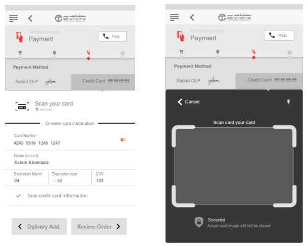
One of the biggest pain points in the checkout user journey that we uncovered through testing was having to fill out long forms when adding payment details. Having to input payment information on a small screen was a common annoyance with most users.
Since mobile devices have specific capabilities, we were able to make use of the camera function to allow users to scan their credit cards and automatically filling the form, minimizing user input while also delivering an innovative solution to the mobile experience.

Wireframe of payment details and card scan pages
Since the development of the app was being done by a third-party vendor, we created detailed transition maps to specify all in page transitions and transitions between pages. This helped to ensure that the care and effort put into creating the designs would be fully realised in the final product. One of the deliverables for interaction design is the transition map as shown in the following picture.

Transition maps
Impact and Results
Our final designs were a complete overhaul of the original Jarir mobile app, delivering best-in-class user experience for their customers. On-brand visual designs complemented improved information architecture and interface interactions, creating user journeys that were quicker and, more importantly, frustration free.
In addition, the internal Jarir team were provided with detailed style guides and interaction maps to enable them to apply our designs and information architecture throughout their digital ecosystem.


