Smartphone adoption and its influence on people’s lives is growing at an exponential rate.
In 2016, more than 28 percent of the world’s population used a smartphone. Statistics forecast the number of global smartphone users to reach 6.1 billion by 2020.
Smartphones have become a go-to source for all sorts of information because they’re easily accessible anytime, anywhere. Beyond communication and information gathering, services and features such as banking, placing orders, healthcare tracking, and even home security have become part of the smartphone experience.
But designing a usable and enjoyable mobile experience is more than just good aesthetics. In order to trigger positive reactions, you have to satisfy the basic usability principles of interface design.
Here are 10 tried and tested UX design principles that are key to creating great mobile user experiences.
1. Content Prioritization

Human attention spans are really short. Like really, really short. 8 seconds to be exact. This makes it extremely important to grab your users’ attention within the first few seconds of interaction with your products.
Less is more. When designing your products, keep interface elements to a minimum. Simple designs are what keep the user engaged and at ease with products.
Display only essential content and functionalities the user needs. The limited space available on a small screen makes every additional element you add overwhelming to your users. Secondary content should be available through a menu. Menu lists, either short or long, should have progressive disclosure and simple terminology so as not to confuse your users. To further reduce clutter, use icons instead of text wherever possible.
Prioritize content and remember that notifications for new content should appear without interrupting primary content!
2. Make Navigation Intuitive

“If the user can’t use it, it doesn’t work.”– Susan Dray
Learnability of your design is key for its success. Users should intuitively be able to navigate through your app via clear pathways and be able to complete all primary tasks without requiring any explanations.
Users lack the patience to try to work through complex steps to get what they want. If it takes too much time or effort to discover how to navigate through your product, chances are you’re just going to lose your users.
User journeys should be logical enough that a task is accomplished within a single app. Don’t make users have to switch between pages and apps to get something done. Simplify the process and have all the information needed readily available.
When navigating through your app, the user should always know where they are without wondering how they got there, or what they are to do next.
3. Touchscreen Target Sizes

People interact with touch screens using their fingers, maybe even their toes, but that’s none of our business. The important part is to make interface elements big enough to capture these actions. But how big can you make them with only a small amount of screen space?
People use their thumbs more often than any other finger while using their smartphones. Small touch targets can be frustrating because they require more accuracy and are prone to errors. Apple’s iPhone Human Interface Guidelines suggest a minimum target size of 44 pixels wide x 44 pixels tall. In the Windows Phone UI Design and Interaction Guide, Microsoft suggests a touch target size of 9mm/34px with a minimum touch target size of 7mm/26px.
Not only is the size of the target important, but so is the spacing between targets. If action buttons are too close to each other, you risk the user making undesired actions leading to frustration. It is especially important to space out contradicting action buttons, such as the save and delete buttons to avoid errors.
At the end of the day, we’re all human and make mistakes, even when target size and spacing are scaled properly. That’s why including an undo button in your designs will relieve many people (including yourself) when mistakes are made.
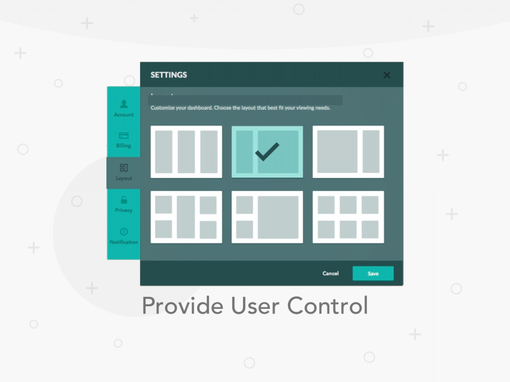
4. Provide User Control

People like to feel like they’re in control of their actions. So that’s what you need to give them.
Allow users to make decisions to personalize their journeys. Changing settings, controlling notifications and cancelling actions provides the user with a sense of control over the system. Apps can suggest actions or provide warnings, but they shouldn’t be the ones doing the decision-making.
When the user needs to know what’s going on, let them know! Integrate status and other types of feedback into your interface without disrupting the user’s workflow. If an app requires signup, let them demo it first or continue as a guest to sample it before making the decision to commit. This gives the user a sense of freedom and transparency.
5. Legible Text Content

The key to mobile typography is readability. If users can’t read your content, there’s no point in offering content in the first place. Communicating your designs in a clear, simple layout delivers your message effortlessly.
The strategy for optimal mobile typography is a balance between legibility and space conservation. Generally, anything smaller than 16 pixels (or 11 points) becomes challenging to read for any screen. Adversely, an unnecessarily large font size results in awkward breaks and hyphenation that take longer to read. Hence, tiring the reader.
Accessing the same amount of information from a desktop on smartphones requires a higher interaction cost because of screen size. Content should be accommodated for smaller screens while maintaining all the necessary information. Crowding a small space with too much content makes it difficult and straining for users to read. A good rule of thumb is to use 30–40 characters per line for mobile.
Spacing and layout are also important to improve legibility. Adding space between text aids the user in reading and creates a feeling that there isn’t so much information to take in.
6. Make Interface Elements Clearly Visible

People use their phones everywhere. Indoors, outdoors, in planes, trains, buses, cars, underground, overground (you get it right?), you name it, they’re on their phones.
It’s important to have sufficient contrast between content and background in your designs so it’s legible, in any setting, even outside in the sunlight. But getting the right amount of contrast isn’t always easy. WC3’s Web Content Accessibility Guidelines gives contrast ratio recommendations for images and text. The most important part in choosing your text and background is to test it out with users.
7. Hand Position Controls

Hand positions should be kept in mind when placing controls on a mobile design. Research findings on how people hold and interact with their mobile phones found that 49% of people rely on one thumb. This statistic is useful to keep in mind when designing to accommodate for the thumb’s reach zone.
Common features should be placed in easily accessible regions, while actions such as delete buttons should be placed in areas harder to reach to avoid errors.
Accessibility behavioural features should be made available to users to make navigation easier. Apple offers several accessibility features like double tapping the home button which drags the entire screen to an easier reach zone.
Delivering a great mobile UX takes into consideration all different types of users. Keeping in mind right- and left-handedness is also a design feature to consider.
8. Minimize Data Input

Ever start typing on your mobile phone and find a few extra letters that have nothing to do with waht hyour’re ar3e tryaing to saay? Happens to the best of us.
Typing on small devices can be annoying and unfortunately there really isn’t a direct solution to it, other than autocorrect (which let’s be honest, isn’t always accurate). But what you can do is work around the problem by minimizing the need to enter data in your designs.
Users are always looking for shortcuts and efficient ways to get things done. Help them reduce typing required by shortening forms, removing unnecessary fields and using ‘remember me’ options for future use. Relieve users by providing autocomplete, recent search history and location detection to reduce data entry requirements and accelerate the experience.
Display keyboard variations depending on the required data, for example for phone numbers provide the numeric keypad for faster input. All these changes can make a big difference in task success rate and task time, and more importantly keeping the user engaged and satisfied with your product.
9. Create a Seamless Experience

When it comes to creating online journeys the ultimate goal is to create a seamless experience, across all devices. But that’s easier said than done.
Seamless experiences are invisible. The user doesn’t realize it, but the flow is a natural process and the user feels ‘right’ using it. Functional, flexible, and responsive mobile designs are what users today expect to encounter.
Focus on key user goals by reducing friction, minimizing steps and page loads to decrease interaction time. Make content accessible even without an online connection and provide alternative paths to avoid dead-ends. Make use of the mobile phone’s features, like the camera to scan barcodes, GPS for identifying locations and touch ID in place of passcodes to simplify journeys. Users appreciate smooth interactions with designs and are satisfied when their needs are met effortlessly.
Synchronization across devices is a key priority for creating seamless experiences. It makes users feel that their workflow isn’t interrupted and aren’t burdened by having to make the effort of transferring data.
Go beyond basic usability features to create pleasant and addictive experiences. Communicate with your users to understand what they need, and deliver it.
10. Test Your Design

Test early. Test often.
The key to any successful product is to continuously test and optimize.
Usability testing is essential for the success of your products. Test different features, layouts and variations of your designs to see what works best. Build your products with a user-centered approach by testing with real users. With each round of testing, you uncover new ways to improve your design to meet your users needs.
The earlier you discover your problems, the easier and cheaper it is to fix them.
Conclusion
In order to keep up with the fast advancements in technology and shift to smartphone adoption, designing mobile experiences needs to implement usability principles. The future of smartphone technologies is peaking in development and users are unforgiving with lagging systems. Delivering extraordinary experiences for users to experience is the way forward.
Points of Note:
At UXBERT Labs we specialize in UX Research, Design & Development services that deliver world-class experiences. With offices in Riyadh and Dubai, our team of UX Researchers, Designers, and Developers deliver custom designed and built software to help businesses succeed.
Looking for a UX agency in Dubai or Saudi? Email us at hello@uxbert.com and let us show you why we’re an award winning company.
Interested in learning more about UX design? Check out our UX training courses or explore our digital services. You can also view our case studies to see real-world applications.