Psychology has an important role in designing the user experience.
By understanding how different psychology principles influence human behaviour, you can design your products to elicit specific responses and actions from your users.
To get you started, we’ve compiled and simplified 13 psychological principles that will help improve the usability, aesthetics and effectiveness of your designs.
1. Hick’s Law
2. Gestalt Principles of Visual Perception
4. Selective Disregard and Change Blindness
12. Pareto Principle, or 80/20 Rule
13. Fitt’s Law
Imagine going into a restaurant that has over 100 items on the menu. Reading through all the options, and making a decision is going to take much longer than if the menu only had 20 items to choose from. The same goes for designing interfaces.
Hick’s law states that the time it takes for users to make a decision increases as the number of choices offered increase.

Whether or not you are consciously aware of it, the decisions you make are influenced by what you perceive as “worth it”. You subconsciously weigh the costs and benefits of a decision before you take it. This is known as the cost-benefit analysis.
The most effective way of getting people to take action is to make the target action as simple as possible while ensuring maximum benefit out of it. If the costs outweigh the benefits, users won’t take action.
So how do you apply Hick’s law to your web design?
One simple rule. Keep in mind that users arrive at your website with a specific goal. Remove unnecessary links, images, text and buttons from pages to allow users to find what they need and do what they want as quickly as possible, no distractions.

This website is cluttered with distractions irrelevant to the purpose of the website, making it probably the most unusable website on the internet. (Source: www.lingscars.com)
Hick’s law in your design also applies to how you arrange your information architecture. Instead of providing all the navigation options immediately, give users broad categories to start off with, then break them down into further subcategories.

Breakdown of options into categories and good use of white space makes the user more likely to respond faster. (Source: www.thenorthface.com)
Shorten long lists and reduce the amount of options where possible. In cases where long lists are inevitabe, limit the number of options the user can view at a single time to make scanning easier and faster.

Break down complex processes, such as registration or checkout processes, into more manageable and simplified steps. Offer clear paths to reduce navigation time and bounce rates in order to create a delightful user experience.
Your aim should always be to reduce the time it takes for users to make their decisions, so they end up making one.
2. Gestalt Principles of Visual Perception
Our brain processes information in a fascinating way.
Often times our perception is manipulated by how we see objects and relate them to each other based on spacing. Gaps, incongruities or disturbances are overlooked by our brain based on the laws of organization.
The Gestalt theory explains that viewers subconsciously group together separated objects to perceive them as a whole.
The principles of Gestalt theory are organized into six categories:

Law of Symmetry: Humans naturally find symmetry aesthetically pleasing, so when we look at certain objects, we see them as symmetrical shapes that form around their centers. Starbucks and McDonald’s logos are great examples of how symmetry is applied in design.


Law of Proximity: When elements are placed close together they are perceived as a group. The example below show the difference in the lines of the adidas logo. When the three lines in are placed at random, further away from each other, they are not perceived as one unit. The close proximity of the slanted lines is what unifies them to be seen as one image.

Similarly, Unilever’s logo consists of several distinct objects, but is wholly seen as one unit because they are in close proximity to each other and are similar in color and size.

Law of Similarity: When placed in close proximity to each other, similar objects are often related to each other. The example below shows identical circles placed beside each other, but because they are colored differently, each row is perceived as a single unit.

Figure and Ground: Users differentiate between an object (figure) and its surrounding area (ground) and can switch between them to view different images. The logo for the Hope for African Children Initiative makes use of this principle by creatively using the white space as the African map silhouette while forming the image of a child and an adult with the surrounding orange shades.

Law of Closure: An incomplete object is perceived by the brain as a whole by mentally filling in missing information. When users see IBM’s logo their brain unconsciously fills in the gaps to complete the shape of the letters making it legible.

Law on Continuity: This psychological phenomenon occurs when the eye is compelled to move through one object and continue to another object. This is often achieved through the creation of curved lines, allowing the eye to flow with the line. The logo for Hotel Association of Canada makes the user’s eye naturally follow the smooth flowing crossbar of the “H” that leads directly to the maple leaf.

3. The Psychology of Persuasion
Influencing others is a science of human behaviour that can be used to help improve the success of your business. Users need to be convinced before taking action on any website. To gain and maintain satisfied users,the Psychology of Persuasion can be one of the most powerful approaches.
Dr. Robert Cialdini in his book, “Influence: The Psychology of Persuasion” coined the 6 Principles of Influence and they are:
Reciprocity
Offering something of value upfront to your users will make them feel indebted to you and more to take a desired action. A common example of this is offering free ebooks, blog posts, podcasts or other free content in return for the user’s email address.

This website offers free newsletters containing giveaways in exchange for the users email address, creating a high benefit to low cost. (Source: http://everydaycarry.com)
Authority
People tend to obey experts and authoritative figures of high-status as they are regarded as highly trustworthy. Authority is usually conveyed through titles (Dr., Prof., CEO), visual appearance and success of a brand.
Academic and high-status titles help people rely on others by assuming that they have an extensive knowledge of the field. Associations with successful companies are often mentioned to establish a certain level of respect and credibility of the company.

(Source: www.atomic.io)

Both companies use authority by providing leading brand clients to establish a sense of trust and reliability with their services. (Source: www.principleformac.com)
Scarcity
People attach more value to things that are limited in number or are available for a limited time. Limited inclusion, creating a sense of exclusivity by making the service “invite-only” or previewing limited information without a signup, is also a major aspect of the scarcity principle. It triggers a psychological phenomenon known as FOMO, or “Fear of Missing Out”.
A good example of this is used on Booking.com where visitors are shown how many rooms are left, creating a sense of urgency to make a decision before it’s too late. Groupon and many other online ecommerce websites also use the scarcity principle by providing a countdown to the deadline of the offer.

Displaying the limited number of remaining rooms makes the user more likely to take an action before there are none left. (Source: www.booking.com)

This online store uses a countdown timer for a limited time sale to create a sense of urgency in the user to take action before they miss out on the savings. (Source: www.extrastores.com)
Liking
You are more likely to agree to requests made by the people you like. From your closest friends to complete strangers who you are attracted to. Major brands often use celebrities, athletes and models to make products and services more favorable.

Turkish Airlines cleverly used two admirable athletes loved by millions to promote their brand and created a buzz around their airlines. (Source: www.turkishairlines.com)
People agree and follow others that are similar to them in terms of interests, opinions, personality and other traits. Interacting with your users through different channels of social media and blog posts to establish a relatable feeling to your users will definitely help improve your reviews and ratings.
Social proof
People don’t always know why they behave the way they do. We look to others to guide our behaviour and decide what the “right” thing to do is. We look for validation for our actions and decisions from experts, celebrities, previous users, large groups or peers.
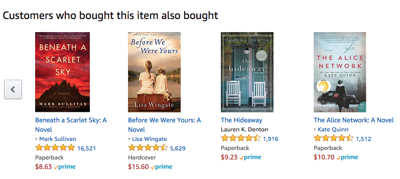
In e-commerce, websites use social proof such as ratings, reviews, and recommendations to attract other users and guide them in making their purchase decisions. Amazon has a section of “Customers Who Bought This Item Also Bought” to make items more relatable to you and get users to think “If they need it, I need it too”.

Amazon influences customers using social proof. (Source: www.amazon.com)

Extra stores website makes use of expert and customer reviews and ratings to persuade users in their purchase decisions. (Source: www.extrastores.com)
4. Selective Disregard and Change Blindness
Want to know where to place certain information on your website?
Then it’s important to understand your users. If you don’t understand how users interpret what they see, you can’t make designs that will be effective.
When online, users have learned to naturally ignore what they consider irrelevant. This behavior is known as selective disregard.
Because it is impossible to give attention to every stimulus in our environment, we use selective attention to select what stimuli are important as events occur.
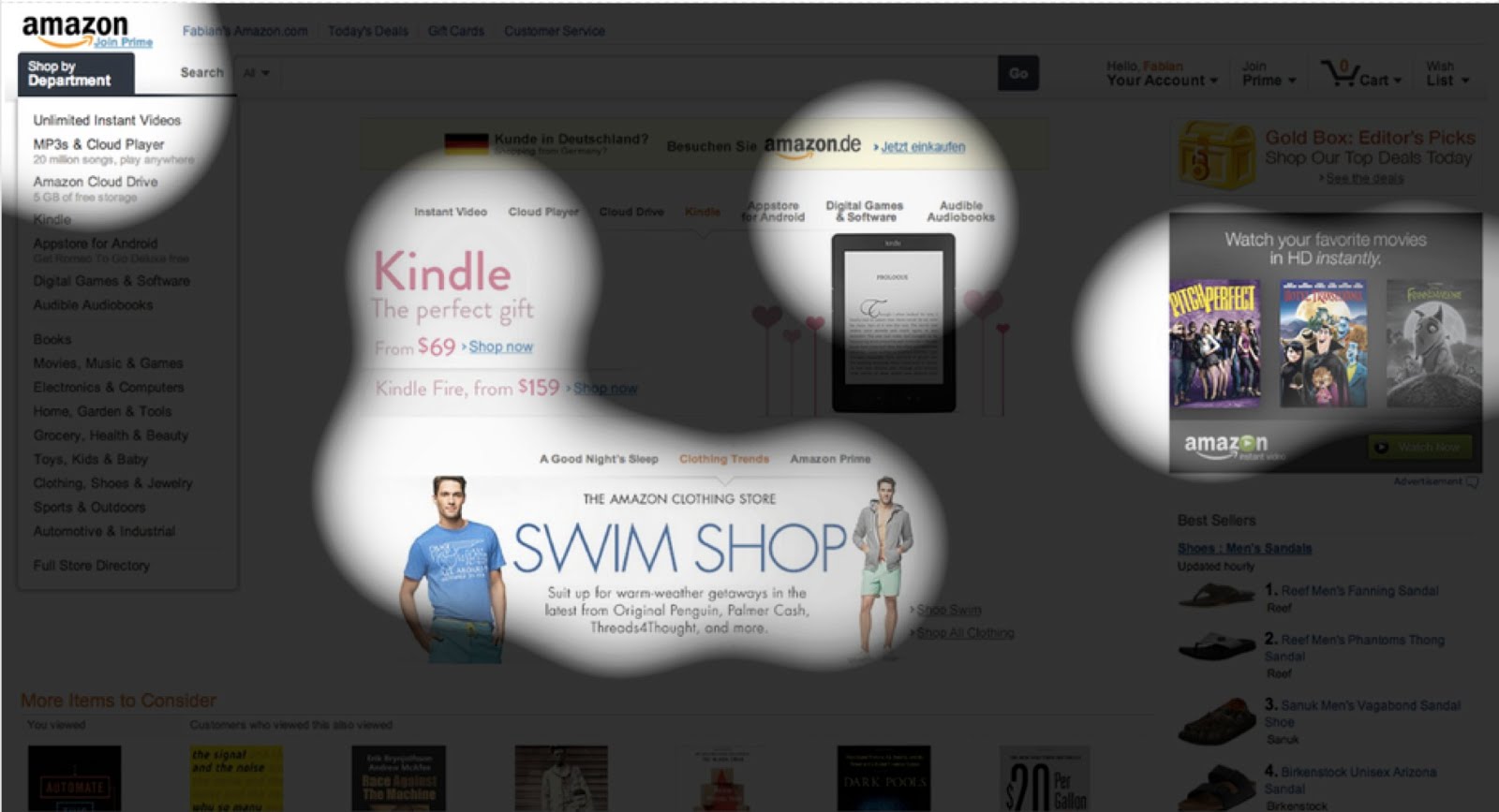
With an attention span that has dropped from 12s to 8s since the mobile revolution began, users look for what they need as quickly as possible. If they don’t find it immediately on your site, they won’t hesitate to search elsewhere.

The highlighted areas show where the users look while using this site, anything outside these areas could go unnoticed. (Source: www.eyequant.com)
Change blindness occurs when a change in visual representation takes place but the observer does not notice the change. In web design, change blindness can occur from an interruption to our visual perception such as page reload, blinking, page orientation changes, or quick changes in visual details.
Change blindness can affect critical information such as error messages and navigation menus, leading to user confusion and task failure. Placement and contrast of content is key when designing to avoid being overlooked by users.

The Add to Cart button on Vans website changes to Out of Stock with no indication that can easily go unnoticed by the user. (Source: www.nngroup.com)
“Memory is deceptive because it is colored by today’s events.” – Albert Einstein
Memory isn’t always reliable. The way we store information is reconstructed by our thoughts, feelings, beliefs and surrounding environment.
Several studies have shown that people often create false memories in which they either remember things that didn’t happen or remember them differently from the way they really were.
Since memory is suggestive and malleable, it’s important to build designs based on the brain’s habit, or mental models (more on mental models in the next post) because they are easier to remember.
Our working memory capacity is around 10-15 seconds, remembering only 3-4 items at a time.
So while designing, assist users by creating experiences that rely on recognition and not recall. Don’t expect your users to remember things from one page to another, go through endless screens of text, or leave them guessing about what is happening.
Provide user assistance and feedback where possible and an undo option to reduce user frustration when they make mistakes. Personalize experiences to cater to your user’s preferences.
Mental models are formed from a person’s experiences and expectations of the real world. People always have a mental model of how to interact with objects or systems.
With increasing time being spent online, users have formed mental models of how to interact with and what to expect from interfaces.
If your product’s design and features don’t match these mental models, then it’s likely your users will initially find the product difficult to use.
To design effective online experiences, you need to match people’s mental models of how they expect to be able to use them.
People expect similar navigation, interactions and terminology throughout their experiences. The most established examples include things like users expecting global navigation to be located at the top of the page, links to be in blue and underlined, and a site’s logo to link back to the home page.

Users expect the option of having one-click social sign-ins. (Source: www.conversionxl.com)
Usability testing, task analysis, observations and interviews are just some of the ways to understand what your users’ mental models are and build upon them.
“Color is a power which directly influences the soul.” – Wassily Kandinsky
Color psychology is the science of how color affects human behaviour. Our ability to see color is a highly complex process. Both the eyes and the brain work together in order to translate what we see in colored images. This translation is subjectively associated with feelings and thoughts and is therefore used as a marketing mechanism in many industries.
Studies show that up to 80% of consumers think that color increases brand recognition. When choosing colors for your website and branding, you should understand your target audience, purpose and timing to maximize efficiency of your design and elicit certain emotions associated with your brand.
But making things look nice also matters. Cognitive psychology research proves that the more attractive a product is, the more usable it is perceived to be. This is known as the Aesthetic Usability Effect.
Positive feelings and attraction is linked to higher quality, which means if your users like what they see, your sales will increase. People will often overlook usability issues because of pleasant aesthetics.
Let’s take a look at the general characteristics of each color.

Blue: strong, honest, calm, loyal, trustworthy, secure
Corporate businesses often use blue to convey a neutral sense of trustworthiness. Facebook’s blue color scheme helps convey to users that it’s a secure, strong social network.


Red: energy, love, exciting, action, bold, passionate
Coca-Cola is one of the classic examples of how a company has used red in its branding to communicate how exciting and energetic it is as a product.


Orange: happy, sociable, friendly, affordable, enthusiasm
Orange is often used to draw attention and is considered a color of enthusiasm. Children’s channel Nickelodeon uses orange in their branding to give the impression of a happy, playful environment.


Yellow: logical, optimistic, forward-thinking, confidence, playful
Yellow stimulates our mental abilities and offers uplifting feelings and cheerfulness. The color is the most highly visible of all colors, which is why it can’t go unnoticed.


Pink: feminine, passion, youthful, fun, gentle, nurturing
Pink is a combination of powerful red softened with the purity of white. It’s often used to show tenderness paired with excitement.


Purple: imaginative, creative, nostalgic, royalty, spirituality
Purple stimulates imagination, bringing emotions of energy of red in combination with spirituality of blue.


Green: growth, organic, natural, fresh, stability, positivity, comfort
Green is a balanced color that is easily relatable because of its natural occurrence in our environment. Whole Foods uses green in their color scheme for the connection with its products to nature and freshness.


Brown: earthy, simple, honesty, security, protection
Brown is a down-to-earth color that represents structure and stability. It elicits feelings of friendliness and loyalty. Courier service, UPS elicits user trust through it’s brown branding scheme.


Black: sophistication, luxury, seductive, formal, authority, strength
Black is most often seen used by high-end brands to portray their sophistication and luxurious products and services. News channel BBC, uses black in their logo to portray authority.


White: simplicity, purity, light, innocence, goodness
Being the lightest colour, white is regarded as the most complete and pure. Apple is distinguished for its simple white branding techniques creating increased sense of sophistication yet simple-to-use products.

Multi-color: multi-channel, positive, playful, bold, boundless, diversity
Companies with multiple colours suggests that they offer a wide choice of products and services. Google, the classic example of a multi-channel, playful company that communicates it effectively through its use of the multi-color scheme.


Also known as “Isolation Effect”, this principle states that distinctive items are more likely to be remembered than ordinary items. This distinction can be a noticeably different visual, context or experience. To stand out from the rest, your designs should create a memorable experience for your users.

Call attention to important design elements and concepts to make it easier for your users to process and retain what they see and do. Emphasize important details by altering light, color, size, image, font, animation, words and sounds.

Medium uses a green CTA button that contrasts with the background colors to draw attention to it. (Source: www.medium.com)
But keep in mind that the Von Restorff principle must be used in moderation. Trying to make several things stand out can cause your users to become overwhelmed with all that is happening on the screen and lose focus. Remember, less is more.
Ever come across a website you just don’t want to leave because of how beautiful it is?
This feeling is a visceral reaction. It’s an instinctive response to a stimulus or experience created by chemical messengers in our brain. Eliciting visceral reactions through your design will keep visitors coming back for more.
Users make a split-second decision about how they feel about a particular design as soon as they see it. If they enter a site and the layout is not immediately appealing, they may not hang around for too long.
Acquiring a visceral reaction from your users that generates a positive behavioral reaction in them will help you gain their loyalty and support, which will in turn help develop a better image for your brand.
Simple design elements such as fonts, colors, imagery, and icons can be determining factors of the overall feel of the site. People are most comfortable with things they can relate to, so while creating a unique experience keep in mind to maintain an underlying familiarity.

Airbnb uses intriguing imagery of destinations to elicit a positive visceral reaction associated with using their website. (Source: www.airbnb.com)
Make it easier for your users to remember important things from your website by taking advantage of the dual-coding system. The dual-coding theory suggests that memory has two distinct but interconnected systems, one for verbal information and the other for non-verbal information. The relationship between these two channels affects memory and learning.
You create visual images for words in your mind based on your experiences and perception of the real world. Think of the word “tree” your brain automatically imagines a brown trunk and green leaves, or something along those lines. By pairing words with images, it makes them easier to recall upon mentioning them.
We see this in children’s books all the time. Not only is it for the visual appeal, but it helps children learn new words by imprinting the images associated with them.

Dr. Seuss is famous for using the dual coding system in his books for children, making it easier for children to remember what they read.
Pair an article of text with a visual representation to allow readers to grasp the idea faster, engraving it into their memory. Infographics are a great example of how to make use of the dual-coding system.
Designers need to focus on the design of content itself and not just the layout to both convey messages and ease learnability creating intuitive experiences.
“I found that I could say things with color and shapes that i couldn’t say any other way” – Georgia O’Keefe
Our subconscious mind responds to shapes by associating them to qualities that we think they are representative of.
We form these connections from universal associations that we encounter without even being consciously aware of it, such as the red octagon that is globally-known as the STOP sign. Brands use shapes along with colors to form their logos and other visual elements to trigger emotional connections with their brand.
Some commonly used shapes are:
Circles, Ovals, and Ellipses
Round shapes create a positive emotional message, perceived feminine trait and suggest community, infinity, relationships and unity.


Squares and Triangles
Logos that have straight edges suggest stability, strength, professionalism and efficiency. Triangles are related to power, and associations with science, religion and law. These shapes are often viewed as a masculine quality.


Vertical Lines
Vertical lines in logos such as Cisco and SoundCloud are associated with masculinity, strength, and aggression.


Horizontal Lines
Horizontal lines in logos such as AT&T and Human Rights Campaign are connected with community, equality, tranquility, and calmness.


12. The Pareto Principle, or the 80/20 Rule
The Pareto Principle, also know as the 80/20 Rule or the Law of the Vital Few, states that just 20% of the work that you have done to achieve something is responsible for 80% of the results that you’ve achieved. Simply put, you only need to fix a little in order to get a lot of positive change.

Trying to tackle and perfect all your issues at once is overwhelming and yields diminishing results. Prioritising your efforts on the small portion that could have the biggest impact will definitely help you fare better.
Analyze your design’s functioning to discover your 80/20 requirements. With fewer elements to focus on, you can maximize precision and finesse to increase conversion rates with minimal wasted efforts.
Keep in mind that although you do want to focus on the 20 percent in your design, it does not mean the remaining 80 percent is irrelevant. Where time and resources permit, fine-tune all details to create the ultimate user experience.
Fitts’ Law proposes that the time taken to move to a target area is a function of the size of the target and distance to the target.
The law suggests placing target buttons closer to expected mouse locations and making them larger to decrease interaction time. This concept is important in web design because the time required to take a desired action affects conversion rates and any additional time is a risk of losing a potential customer.
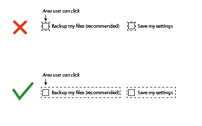
Increasing link size when hovering over items, as in Apple Macbook’s menu bar, is useful for increasing usability index. A common misuse of Fitts’ law is when the text of a menu bar is clickable but the tabs themselves are not, decreasing its usability index.

The law can also be used for undesired actions, such as delete buttons, decreasing their target size and placing it further away from mouse position reduces the likelihood of making mistakes and frustrating the user.
Conclusion
Considering psychology in your design process helps fulfill business goals while strengthening user relations. Understanding how a design is perceived and interpreted is a crucial asset that designers must possess.
Follow usability best practices to satisfy usability principles. Enable learnability, efficiency, and memorability of your system. Take advantage of psychological principles to ethically guide user behaviour. Create seamless experiences to boost conversion rates and user satisfaction.
Any successful design will need updating from time to time, but the best part about psychology principles is they’re timeless solutions to your designs.
At UXBERT Labs we specialise in using scientific UCD processes to design world-class innovative and beautiful experiences. With specialist UX teams in Dubai & Riyadh, we’ll design and build software that will help your businesses succeed. If you have a project you’d like to work with us on, get in touch at hello@uxbert.com
Interested in learning more about UX design? Check out our UX training courses or explore our digital services. You can also view our case studies to see real-world applications.