Conversions and user experience are closely linked. When customers want to buy something from your website, they are more likely to go through the entire shopping process and make a purchase if the quality of their experience is delightful.
Below are some design recommendations to improve consumer user experiences and boost your conversion rates through the roof.
1. Design to Build Trust
Simply put, if people don’t trust your website, they won’t buy from it.
The look and feel of a website affect the feeling of online trust. The design of your website plays a huge role in how consumers perceive not only the website but also the company.
While designing your website, make sure you take the following suggestions into account:
Make sure that the design of your website is simple, clean and professional. The homepage content and the navigation must be well organized and the site should use colors and images consistently.
Don’t overwhelm customers with unnecessary images and animations. This not only annoys them but also slows down the load time of your website and could make consumers skeptical of the legitimacy of your site.
Make sure your labels are clear and understandable. When people are faced with unfamiliar category names, they may not be able to know if the website contains what they’re looking for. This will frustrate them and they will abandon the site.

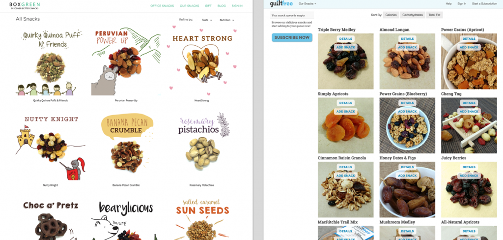
BoxGreen (left) is more appealing than GuiltFree (right) because of the site’s high-quality images and wise use of empty space that allows those images to stand out without cluttering the overall look and feel.
Just like in real life, being honest and upfront with all relevant information is necessary for building trust on the web.
People appreciate when sites are transparent with all information that relates to the customer experience. You should always include details like contact information, base cost, additional fees or charges accompanying a purchase, return policies and guarantees, and/or shipping charges.
Make sure to add detailed and accurate information related to the website. This shows that the organization is well informed, up-to-date and committed to helping its customers.
Whenever possible, avoid using promotional content like advertisements. Nobody likes flashy banners and popups because they seem untrustworthy and spammy.
In situations where you need to have ads, separate the sponsored content from your own. Use a style of writing that is clear, direct and sincere.
2. Make it Easy to Buy from You
The highest abandonment rates are at the checkout page. Customers will go through the effort of shopping on your website, but if the checkout stage is too lengthy or complicated, they’ll simply leave.
Make the payment process as simple as possible. The design of the payment form is important because there’s nothing worse for an e-commerce site than to lose customers because of cart abandonment at the last stage of checkout. Some tips to improve the payment process are:

Well-known logos in the payment form increase a feeling of security.
3. Add More Details to User Reviews
Users need to be convinced before taking action on any website. To gain and maintain satisfied users, the psychology of persuasion can be one of the most powerful approaches. Influencing others can be used to help improve the success of your business.
Reviews are helpful because they’re written by people who actually bought and used the product. Websites can improve their review system by offering additional information such as:
This additional information can not only increase trust, it can also help users to easily find reviews that are relevant to their situation.
Review summaries can help users go through multiple reviews to see what common issues or strengths the product has.

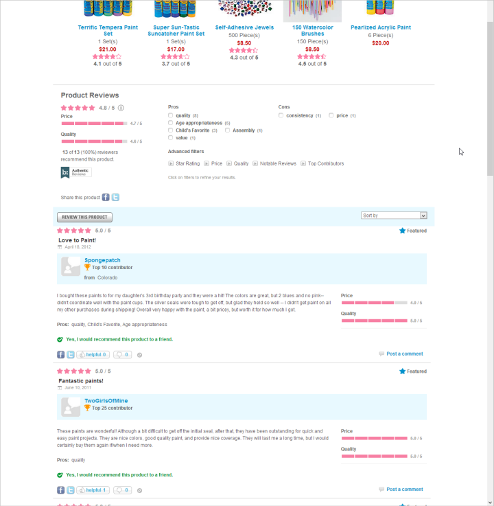
This website includes criteria for price and quality with their reviews. Review summaries are provided at the top of the page.
4. Use Clear Call-to-Action
Make sure your call-to-action button is immediately obvious to people.
If you want people to click on your call to action button, make sure it has a large clickable area and that the placement of the button is on a prominent location such as the top of the page.
Make appropriate use of whitespace and contrasting colors to make the button stand out from other page elements.

These call to action buttons are easy to spot and the user knows why they should click this button.
5. The Bigger the Better
On e-commerce sites, a picture can be worth a thousand dollars. Make sure you use large and detailed images. Large images can show more detail and offer more information.
But adding larger images does not mean you should reduce the size of product descriptions.
Detailed descriptions can answer a lot of the consumer’s questions about the product. This is not to say that the descriptions need to be too extensive. But users have to be able to quickly and easily find and use the product description when they want to.
If you don’t have enough space, you can write a brief description with a link leading to additional details. The description should be clear and descriptive. Users can look for details if they need to but they should not have to struggle to find the product information in the first place.

Large product images allow shoppers to see more product detail.
6. Make your Search More Efficient
It’s important to prioritize search results as accurately as possible. You can do this by tracking the most popular keywords and giving relevant suggestions based on the available stock and the buyer’s search history.
For doing this, your website should incorporate ’semantic search’ (the ability to put searches into context).
For example, if someone wants to buy a striped t-shirt, the search results should present the option “striped t-shirt” just on typing “t-shirt”
This increases the probability of a user buying from your store. Search functions which present keywords just based on exact typed keywords may not necessarily match what the user wants.

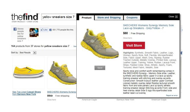
TheFind incorporates long-tail semantic searches in its results
Conclusion
With a large number of e-commerce services emerging today, it is becoming more important to deliver a good user experience to your customers in order to stay relevant in a changing marketplace. These six tips are meant to be simple guidelines for designing user experiences which can increase conversions on your website.
At UXBERT Labs we specialize in UX Research, Design & Development services that deliver world-class experiences. With offices in Riyadh and Dubai, our team of UX Researchers, Designers, and Developers deliver custom designed and built software to help businesses succeed.
Looking for a UX agency in Dubai or Saudi? Email us at hello@uxbert.com and let us show you why we’re an award winning company.
Interested in learning more about UX design? Check out our UX training courses or explore our digital services. You can also view our case studies to see real-world applications.